
OneBuckeye
Posts: 5,888
Sep 13, 2011 9:11am
http://www.facebook.com/usnikefootball#!/usnikefootball?closeTheater=1
Pro combats are out. Looks like Ohio State got the leftovers from Georgia's unis. The helmet is terrible. They also gave Michigan state a Notre Dame makeover. SMH. So bad.
Pro combats are out. Looks like Ohio State got the leftovers from Georgia's unis. The helmet is terrible. They also gave Michigan state a Notre Dame makeover. SMH. So bad.
OneBuckeye
Posts: 5,888
Sep 13, 2011 9:17am

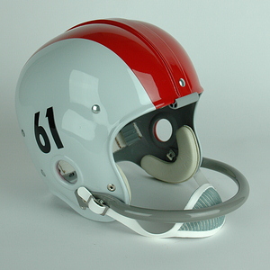
OSU 1961.
Ok so I get the helmets now... I like the oversized numbers, but hate the rest of the jerseys and pants... Why didn't they just copy the above?


stroups
Posts: 3,223
Sep 13, 2011 9:19am
Absolutely terrible
OneBuckeye
Posts: 5,888
Sep 13, 2011 9:19am

Also not sure why Ohio State got the real tree camo under the jersey and on the gloves... wtf is supposed to be on them?
krambman
Posts: 3,606
Sep 13, 2011 9:32am
This is by far the worst look Nike has come up with for Ohio State. I understand that there will be a faction of fans out there that love them and will go out and buy them, which will bring in more money for the university, but I think these are simply awful. It amazes me how Nike could hit a home run with Oregon's and Boise State's jerseys, and then give us a dud like this.

OSH
Posts: 4,145
Sep 13, 2011 9:32am
I saw a comment about how the under shirt has "half-sleeves." They then followed it with "that's just what Ohio State needs." 
Recycled Georgia unis...terrible. Definitely need the "O" on the gloves.
Michigan State's are bad too, I agree. Another reason Nike sucks.
Recycled Georgia unis...terrible. Definitely need the "O" on the gloves.
Michigan State's are bad too, I agree. Another reason Nike sucks.

oberhaus
Posts: 868
Sep 13, 2011 9:39am
NIKE=FAIL
ADIDAS=WIN
ADIDAS=WIN
V
vball10set
Posts: 24,795
Sep 13, 2011 9:43am
it doesn't matter, since we'd get flagged for showing it......and I agree!!!OSH;894135 wrote: Definitely need the "O" on the gloves....... another reason Nike sucks.
OSH
Posts: 4,145
Sep 13, 2011 9:44am
I think that was one of those fluke things that happened. I don't see it repeating...to anyone. Ever. Again.vball10set;894152 wrote:it doesn't matter, since we'd get flagged for showing it......and I agree!!!
V
vball10set
Posts: 24,795
Sep 13, 2011 9:46am
I hope you're right, 'cause I like it, no matter who does itOSH;894155 wrote:I think that was one of those fluke things that happened. I don't see it repeating...to anyone. Ever. Again.

se-alum
Posts: 13,948
Sep 13, 2011 9:46am
I don't mind them.
krambman
Posts: 3,606
Sep 13, 2011 9:49am
I wouldn't be surprised if OSU asked to have different gloves this year so they wouldn't run into the same problem they had last year.OSH;894135 wrote:Definitely need the "O" on the gloves.
OSH
Posts: 4,145
Sep 13, 2011 9:57am
Ohio State is the only team out of the new releases (Army, Navy, OSU, Stanford, and Michigan State) to not have their logo/brand on the palm of the gloves. That's a joke.
I don't remember if Boise or Oregon had them...my guess would be that they did.
I don't remember if Boise or Oregon had them...my guess would be that they did.

JerseyBuck
Posts: 429
Sep 13, 2011 10:01am
As some have already said, I wouldn't be surprised if Ohio State asked not to have the block O on the gloves because of what happened last year.
The wood design comes from Buckeye Grove.
The helmets are nice. The rest..........not a fan.
The wood design comes from Buckeye Grove.
The helmets are nice. The rest..........not a fan.

Automatik
Posts: 14,632
Sep 13, 2011 10:05am
I like!


grodt
Posts: 1,588
Sep 13, 2011 10:28am
I like LSU's especially the tiger eyes on the gloves. MSU's look like South Florida. I like OSU's jersey but I don't get the fascination at Nike with that huge helmet stripe. It looked dumb on Georgia and looks dumb now. Stanford is bleh. Army and Navy are both sharp and didn't really change too much which is a good thing.
JerseyBuck
Posts: 429
Sep 13, 2011 10:41am
grodt;894200 wrote:I like LSU's especially the tiger eyes on the gloves. MSU's look like South Florida. I like OSU's jersey but I don't get the fascination at Nike with that huge helmet stripe. It looked dumb on Georgia and looks dumb now. Stanford is bleh. Army and Navy are both sharp and didn't really change too much which is a good thing.
End of Line
Posts: 6,867
Sep 13, 2011 11:29am
I like them a lot more than last years.
E
enigmaax
Posts: 4,511
Sep 13, 2011 11:48am
Oregon does...and apparently it was going to be a problem, but now it isn't.....sometimes.OSH;894172 wrote:Ohio State is the only team out of the new releases (Army, Navy, OSU, Stanford, and Michigan State) to not have their logo/brand on the palm of the gloves. That's a joke.
I don't remember if Boise or Oregon had them...my guess would be that they did.
http://rivals.yahoo.com/ncaa/football/blog/dr_saturday/post/Oregon-players-warned-to-stop-simulating-Oregon-;_ylt=AhVZNZZb9RHinMnMyksn9iEcvrYF?urn=ncaaf-wp6240

karen lotz
Posts: 22,284
Sep 13, 2011 12:01pm
Navy Pro Combat.


JerseyBuck
Posts: 429
Sep 13, 2011 12:18pm
Navy's are sweet. Best of the bunch, imo.
karen lotz
Posts: 22,284
Sep 13, 2011 12:20pm
Yeah I wouldn't expect Navy to go that route but the helmets are pretty sweet.

Scarlet_Buckeye
Posts: 5,264
Sep 13, 2011 12:28pm
Here is Nike's facebook link to OSU's unis pics.
http://www.facebook.com/media/set/?set=a.10150818530110721.731320.57460905720
http://www.facebook.com/media/set/?set=a.10150818530110721.731320.57460905720
karen lotz
Posts: 22,284
Sep 13, 2011 12:37pm
Couple other pics of Navy's:


grodt
Posts: 1,588
Sep 13, 2011 12:48pm
Ahh I'd never seen pictures of old OSU helmets. It's a bit more defensible now although I still don't like it. I prefer OSU's current helmet.JerseyBuck;894209 wrote: