Art Modell
Senior Member
2,338
posts
Art Modell
Senior Member
2,338
posts
Mon, Mar 28, 2011 7:56 PM
Mar 28, 2011 7:56 PM
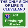
Is there a way to eliminate Cleveland from the logo?
Mar 28, 2011 3:56pm